

In today’s digitalized world, with the increasing population, one thing is increasing daily: "technology,” which is moving at a pace that catching it might be a bit challenging but not impossible. Today, people are entering their digitalized era, whether professional or personal. Therefore, conducting their business online is also essential, as it marks the beginning of a new phase where things are sold digitally, and this has been their functioning for a long duration.
Still, with time, now it has seen a considerable boost. To make your business also circulate at the speed of light or around, one of the needed elements is “a responsive website”, which comes with the requirement of a “responsive web design” where you prepare your exciting or new website in a way that it not only works smoothly, but from its designing, it attracts massive attraction towards their business.
What Is A Responsive Web Design?
We all know how important web design is in building a website. Excellent and engaging web design can help create brand awareness.
It is necessary for a person to take care of the website’s design so that one can easily remember the brand just by looking at the creative web design. This web design feature makes the demand to keep a web design responsive and exciting, which means that one needs to take care of the design to make your website look attractive and responsive.
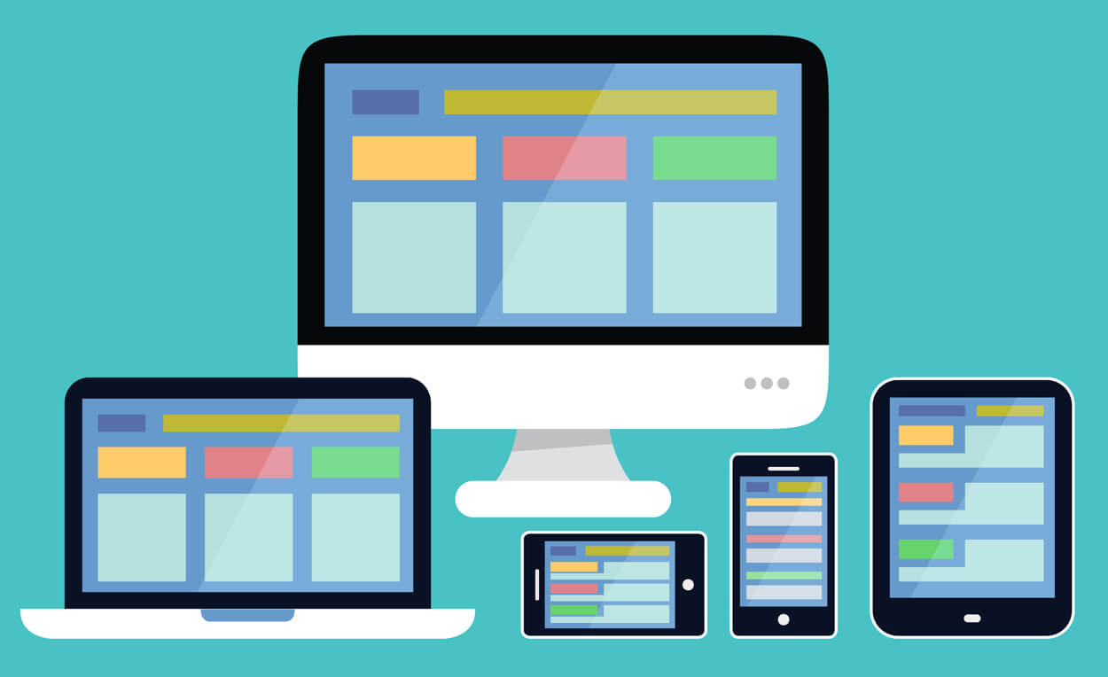
However, responsive web design refers to the design made or used on your website in a way that makes it look more comprehensive and flexible for people to use. This gives you the chance to settle your website content seamlessly in different corners of the website.
What Makes A Website - Responsive?
A website needs to be responsive, but besides that, what’s more needed is to make the website look the way that it brings in the chance to make your website enjoyable to read and view by the audience again and again.
However, various elements must be taken care of to make a website look responsive, making its functioning much more flexible.
Elements that make your website responsive?
- Content - One of the essential elements for making your website responsive is the content put into or mentioned in your website. After all, a website is required to describe your website. This could be quickly done by adding content that makes it look comprehensive in a way that not only entertains but also educates you about your content online on the website.
- Flexible Images — A responsive website functions and adjusts to different devices flexibly. This makes the website look comprehensive and gives the chance to view the content easily. In that case, it becomes essential to make sure the image is flexibly and appropriately considered so that it can adjust in various screen dimensions without differing in size or being too large or too small for the available space.
- Fluid Grids—A website comes with a fluid grid, also known as a “flexible grid,” which allows readers to read or navigate the website flexibly. This feature makes the website look much more impressive, and you can view the web design in a flexible grid on your smartphone, laptop, etc.
Why Do You Need A Responsive Web Design?
A responsive web design impressively makes your website known to people for extended periods, providing massive assistance in increasing brand awareness among the targeted audience.
Enhances Experience is a feature of responsive web design that allows a person to enjoy an improved feature of the website. Being responsive and flexible ensures that the website is better and responsive for use on all devices, such as laptops, tablets, smartphones, etc.
You must create a responsive web design to engage and interest your audience. This will bring consistency to the website's use, making it easier for people to experience optimum use.
A responsive web design provides the benefit of ease of navigation, which helps improve navigation and its usability. It also helps increase user interaction with the content quickly.
The user is able to find the content easily on the website.
A responsive web design optimizes the speed of the website, making it easier for people to optimise the image and content for different devices. This promotes a chance to improve the website's functioning.
A good, responsive web design improves a website. We promote Google’s preference for SEO while ensuring the site ranks well on Google.
A responsive web design promotes the chance to expand the audience reach, which makes it advantageous for website owners to establish a secured, future-proof website while making it compatible with emerging devices in different screen sizes.
These elements of web design boost the quality and functioning of the website by making it more responsive and enhanced.
Tips and Tricks To Make Your Website Responsive?
By now, you must be well aware of how beneficial responsive web design is. It improves the website.
Therefore, if you own a website, it is better for you to make it responsive, as it brings beneficial advantages to your website. With the following practices, you can make your website’s design engaging and responsive enough to make it flexible.
- Pay Attention To Navigation - When you are looking for a better and more responsive web design, it is better for you to focus intensely on the website's navigation bar. With the help of navigation, one can bring in the chance to find any content on the website.
- Use a flexible grid system where it benefits in layout adaptability of the people, viewing the in different screen sizes.
- Qualitative images and media can improve and optimise the website. Good, high-quality photos and media content, like videos, enhance the brand's image and also help improve the website's quality.
- Use cross-device testing to measure the website of the brand. In which the cross-device testing methods give the chance to measure how responsive your website is when it goes online with the people on the net.
- Design Tools —To make your web design look more responsive, consider using Adobe XD, Figma, Sketch, and other platforms, which provide built-in support and allow you to create a responsive prototype.
- Always Plan Your Content - This gives you the chance to develop your content strategies in advance, enhancing the website's functioning. It benefits your website by creating a responsive web design, graphing out the timeline on your website, and keeping your targeted audience excited about every new and upcoming website.
- Keep CTA Clearly On Your Website - CTA - Call To Action is the source of your audience engagement, where putting the option of CTA to your website enhances the quality of your website. Along with this, to make the website responsive, it is essential for the web designers to make it available clearly to the audience.
- Take Care of Your Typography —Typography is also an essential element of responsive web design, which allows people to manage typography in an engaging way. Use the font that best complements your website’s graphics.
Wrap Up
To make your brand popular among your targeted audience, it is essential that you take care of web design online of the website. It makes it preferable for people to engage in the chances of making your website or the brand popularly engaged with the audience.