Many website visitors' first impressions of your company come from your landing pages. Others view it as the crucial stage in the sales funnel where leads are converted. The landing page's design could make all the difference in terms of promoting growth and revenue. You might be making one of these six common landing page errors if your landing page isn't converting. Continue reading to find out more about landing page optimization, or get in touch with Kito Infocom to discuss your website!
The Most Common Six Landing Page Mistakes One Should Avoid
Here are the six most common mistakes that you should avoid while optimizing your website’s landing page.
- Not making mobile-optimized landing pages
- Refraining from using numerous customized landing pages
- Forgetting about your website’s speed
- Putting incomplete pictures and videos on your landing page
- Including ineffective CTAs on your landing page
- Neglecting your landing page’s copy and headline
-
Not making mobile-optimized landing pages
Since the smartphone's introduction has passed, any company that ignores the mobile user experience is making a costly SEO error. Think about the data from the first quarter of 2022:
- Mobile devices accounted for almost 58% of all web traffic worldwide.
- If they have a poor mobile experience, 56% of website visitors say they are less likely to engage with a company.
- A little over half of customers believe that a company's lack of mobile optimization shows that it doesn't value its customers.
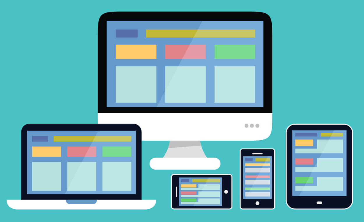
Use responsive designs to streamline your landing pages for mobile users. Avoid using page pop-ups that might be challenging to use on a smaller screen. Leaning into the white space on the page can assist with this. All copy should be in concise paragraphs that won't result in a wall of text.
2. Refraining from using numerous customized landing pages
- Different people visit your website; some are familiar with your brand, while others are just discovering it.
- While some spend hours doing research or receive subpar service from your competitors, others are simply looking for a simple and quick shopping experience.
- Why should your landing page treat your visitors like they aren't all the same?
- When companies increase the number of landing pages from 10 to 15, they can see a 55% increase in leads. Based on your marketing campaigns, you might find a sweet spot closer to 10 or 20 landing pages.
- Create landing pages with a particular call to action (CTA) and message to correspond to various buyer personas, conversion strategies, lead goals, or users' demographic and browsing patterns.
3. Forgetting about your website’s speed
- Your landing page could be doomed before it even sets sail because of functional issues. This is because users find it frustrating to use websites that have bugs.
- However, websites with excellent user experiences may have conversion rates that are up to 400% higher.
- For you to keep visitors, load times are essential. If a page takes longer than three seconds to load, more than half of users leave the site completely.
- Regularly test your website, and if necessary, switch to a better host.
- Reduce the number of unneeded elements that could cause your landing pages to load slowly.
- Some examples include large files or images, frequent page redirects, and a lot of animated or active elements.
-
Putting incomplete pictures and videos on your landing page
Your landing pages should use the right amount of graphics, visuals, and images without overcrowding the page. According to research, users value photos and images even more than they value colour and video. Make yours count by following these suggestions:
- Keep your images generic and unrelated to your article.
- If you want to see 35% higher conversion rates, stick with custom visuals.
- Avoid using visuals or images that might quickly become dated, such as popular memes or allusions to recent events, unless you have a strategy for changing them frequently.
- Remove any obtrusive graphics, such as scrolling banners and GIFs that are in motion.
- In order to prevent images from being pixelated, blurry, or too small, optimize each image to fit your landing page.
-
Including ineffective CTAs on your landing page
The landing page plays a crucial role in increasing leads and conversions thanks to the CTA. Your CTA instructs users on what to do. Take care to avoid making any of these CTA mistakes:
- A surplus of CTAs: Although it's great that you have so much to offer, too many CTAs overwhelm visitors and make them unsure of the best course of action. Just use one or two CTAs on each landing page.
- Lack of CTAs: Users cannot proceed if they are unaware of the next step. Make sure your CTA is clear and actionable.
- Using a general CTA: In specific situations, "Contact us" and "Request a quote" are helpful. Users may be attracted by CTAs that are more inventive and inspiring, such as "view this service page" or "subscribe to our newsletter."
- Burying the CTA: Your call to action (CTA) should be the main focus and adhere to good design principles, such as a readable font and visual contrast.
- CTA not being appropriate for the user: Conversion rates for personalized CTAs are over 200% higher. Both the landing pages and the CTAs should cater to particular users.
- Making the CTA ineffective: Attaching the CTA to a form or clickable button will make it simple for users to respond.
- Failure to fulfil the CTA's commitment: This error is crucial for your landing page. CTA: Never make a lead a promise you can't keep.
-
Neglecting your landing page’s copy and headline
- The headlines on a landing page are very important because they are the first thing visitors see and may convince them to stay.
- To ensure that visitors understand what to expect and why they should respond to the CTA, you should include the most important information at the top of your landing page.
- However, providing too much information can clog the page and put extra barriers in the way of the visitor taking the next step.
- Keep all writing precise, and pertinent. Verify that each sentence advances the main theme of the page.
- To improve readability, use copy formatting techniques like numbered and bulleted lists, visual hierarchies, and different font sizes.
Wrapping up This was our blog on the six landing page mistakes one should avoid. Additionally, we also preferred listing the ways to fix these mistakes if they happened. For any assistance regarding landing page optimization, feel free to contact Kito Infocom. We are the best digital marketing agency in Delhi. We provide various digital marketing and website development-related services. To learn more about Kito Infocom


